Choosing yarn colour combinations for knitting or crochet
Choosing yarn colour combinations for your knitting or crochet poses one of the most challenging decisions. When faced with bags and boxes of all different yarns and colours, it's easy to feel completely overwhelmed.
Colour matters to us more than we often realise. A bright blue sky can lift our spirits, while a grey, drizzly day can leave us feeling flat. The colours we knit and crochet with can have that same effect, and that's something we can use to our advantage.
So if you're struggling to pick colours for your next make, don't worry. In this post I'll share my favourite tips for choosing yarn colour combinations you'll love, a simple guide to the colour wheel, and a few easy tricks for testing colours before you commit.
“Colour is the quickest way to brighten a day. Fill your basket with the shades that make you smile, and let every stitch lift your spirits a little higher...”
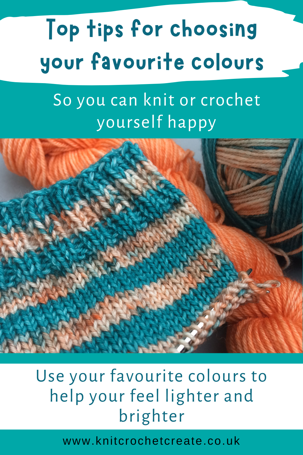
Quick Look: Choosing Yarn Colour Combinations
- Start with what you love – your favourite clothes, objects in your home, and your favourite things hold clues to your happy colours.
- Use the colour wheel theory – complementary, analogous and tonal schemes are reliable starting points. Scroll down to learn more.
- Check the contrast – lightness and darkness (colour values) matters as much as the colours themselves.
- Test before you start – yarn wraps, pegs and mini swatches save a lot of frogging.
Your support helps Google recognise and trust me as a knitting and crochet designer 🌟
How Colours Affect Your Wellbeing
Knitting and crochet are already wonderful for winding down, and the colours you choose can add to that feeling.
When we're tired, sad, or feeling low, many of us naturally reach for darker, muted shades, which can dull our spark even more. But if you have a project ready and waiting in your favourite happy colours, picking it up can give you a lovely boost. You get to enjoy those shades and you'll feel lighter and brighter with every stitch.
That's why I like to keep a "happy project" on the go – something in colours I love that I can turn to when I'm feeling stressed, fed up or under the weather.
Finding Your Favourite Yarn Colour Combinations
Most of us have a favourite colour palette without even realising it, which is why we often end up choosing the same shades again and again. Here are a few ways to discover what you're naturally drawn to:
- Look in your wardrobe. Which items do you reach for most? There's often a clue in the print, the trim, or that little pop of colour that caught your eye when you bought it.
- Look around your home. Cushions, mugs, artwork and even your garden can reveal colours that make you feel at ease.
- Check your yarn stash. Which skeins have you bought more than once? Which ones are you saving because they're "too nice to use"? Be bold and use these in your next project.
- Save pictures you love. A Pinterest board or a folder of photos – landscapes, flowers, fabric – can quickly show a pattern in the colours you're drawn to.
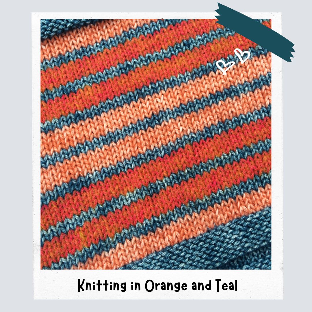
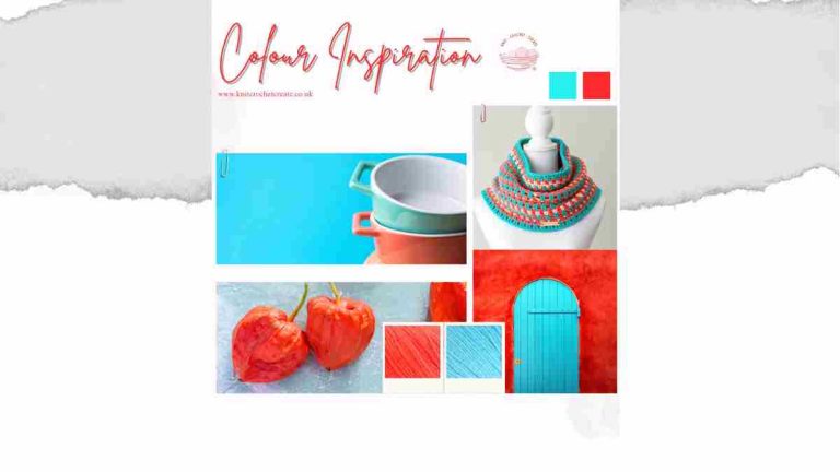
Recently I've been completely drawn to orange and teal. Together they make me feel so happy and relaxed when I'm knitting with them – and there's a good reason they work so well, which brings us to the colour wheel.
Orange and Teal fall opposite each other on the colour wheel. Orange is classed as a ‘warm’ colour and Teal is classed as a ‘cool’ colour (part of the Blue spectrum). Therefore, they make the perfect contrast and they complement each other beautifully.
Basic Colour Wheel Theory For Knitters and Crocheters
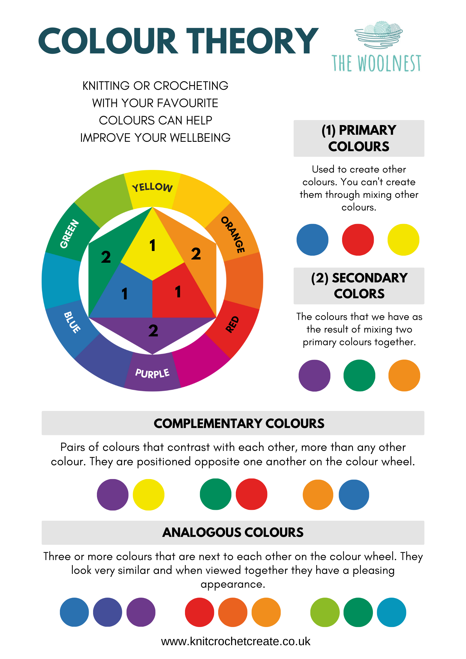
A colour wheel is a really useful tool when you're unsure where to start. You don't need to be an artist to use one – here are the key terms and how they apply to yarn.
Primary and secondary colours
The primary colours are red, yellow and blue. Mix two of them together and you get the secondary colours: orange, green and purple. Using primary and secondary colours together gives a bright, bold, cheerful look – perfect for children's blankets and fun accessories.
Complementary colours
Complementary colours sit directly opposite each other on the colour wheel, such as orange and blue, red and green, or yellow and purple. They create a strong, lively contrast and are brilliant for stripes.
My orange and teal combination is a great example. Orange is a warm colour and teal is a cool colour from the blue family, so they contrast beautifully and make each other stand out.
Analogous colours
Analogous colours sit next to each other on the wheel, such as blue, teal and green, or yellow, orange and red. They blend together harmoniously and give a calm, cohesive feel – lovely for gradients, shawls and blankets.
Tonal (monochromatic) colours
For a tonal palette, choose different shades of the same colour, from light to dark. Working from the lightest tone through to the darkest creates a beautiful fade effect. It's a really easy way to get a sophisticated look.
Warm and cool colours
Reds, oranges and yellows are warm colours and tend to feel energetic and cosy. Blues, greens and purples are cool colours and tend to feel calm and fresh. Mixing one warm with one cool colour is an easy way to get a balanced contrast.
Neutrals
Cream, grey, oatmeal, black and navy are your best friends when a combination feels too busy. Adding a neutral gives the eye a place to rest and lets your brighter colours shine.
Top Tips for Choosing Yarn Colour Combinations
1. Check your contrast with a black and white photo
This is my favourite trick. Line up your yarns and take a photo, then switch it to black and white (most phone cameras have a mono filter). If two colours look like the same shade of grey, they'll blend together in your project. That's fine for a soft, subtle look, but if you want stripes or colourwork to stand out, choose colours with clearly different lightness.
2. Choose a main colour and supporting colours
A good rule of thumb is to pick one main colour for most of the project, one or two supporting colours, and a small accent colour for pops of interest. This stops the colours fighting for attention.
3. Start small
If you're nervous, start with two or three colours. It's much easier to get a pleasing result, and you can always add more once you feel confident.
4. Think about the yarn itself
The same colour can look quite different in a matt cotton, a fluffy mohair or a shiny acrylic. Where you can, compare yarns of the same weight and fibre. If you're using hand dyed or variegated yarn, pair it with a solid or semi-solid shade so the pattern doesn't get lost.
5. Look at colours in daylight
Indoor lighting can change how colours look, especially in the evening. Check your combinations near a window before you make your final choice.
Easy Ways to Test Yarn Colour Combinations
Before you cast on or make your first chain, try one of these simple ways to see how your colours look together.
- Yarn pegs: Wrap yarn around small wooden pegs or lolly sticks, then move them around next to each other until you find a combination you love.
- Yarn wraps: Wrap short lengths of yarn around a cardboard tube or a gift tag to create stripes. This gives you a quick preview of how striped knitting or crochet will look.
- Mini swatches: Knit or crochet a small strip, changing colour every few rows. It's the most accurate test, as you'll see exactly how the colours behave together in stitches.
- Stash line-up: Lay your skeins out in a row and swap them in and out. Take a photo of each version so you can compare them side by side.
You can also try my fun Interactive Colour Picker Tool to help unlock the potential colour combinations hiding in your yarn stash.
FAQs: Choosing Yarn Colour Combinations
Complementary colours (opposites on the colour wheel, such as orange and teal) give bold contrast, while analogous colours (neighbours on the wheel, such as blue and green) give a calm, blended look. Adding a neutral like cream or grey will help almost any combination.
Two to four colours is a comfortable starting point for most projects. Scrappy and stash-busting makes can use many more, but a repeated neutral or a consistent border helps tie everything together.
Muddiness usually happens when colours are too similar in lightness or when too many busy shades sit side by side. Try the black and white photo test, and add a lighter or darker shade to bring back some contrast.
Find Your Happy Colours
I hope these tips help you find your own happy colour combinations and enjoy your knitting and crochet even more. Why not grab a few skeins from your stash today and knit or crochet a little striped swatch? You might just discover your new favourite pairing.

What to Make?
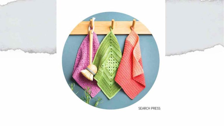
If you can't wait to get started trying our yarn colour combinations, here are a few free patterns that you can try. They all use oddments and are perfect for testing colour combos:
Share Your Makes
I’d love to see your finished projects! Tag me on Instagram [@knitcrochetcreate] so I can admire your creations.
Let's keep in touch!
I'd love to chat more.
Sign up for my newsletter and receive a weekly dose of crafting inspiration, featuring the latest trends, tips, and projects to fuel your creativity.



Really needed this
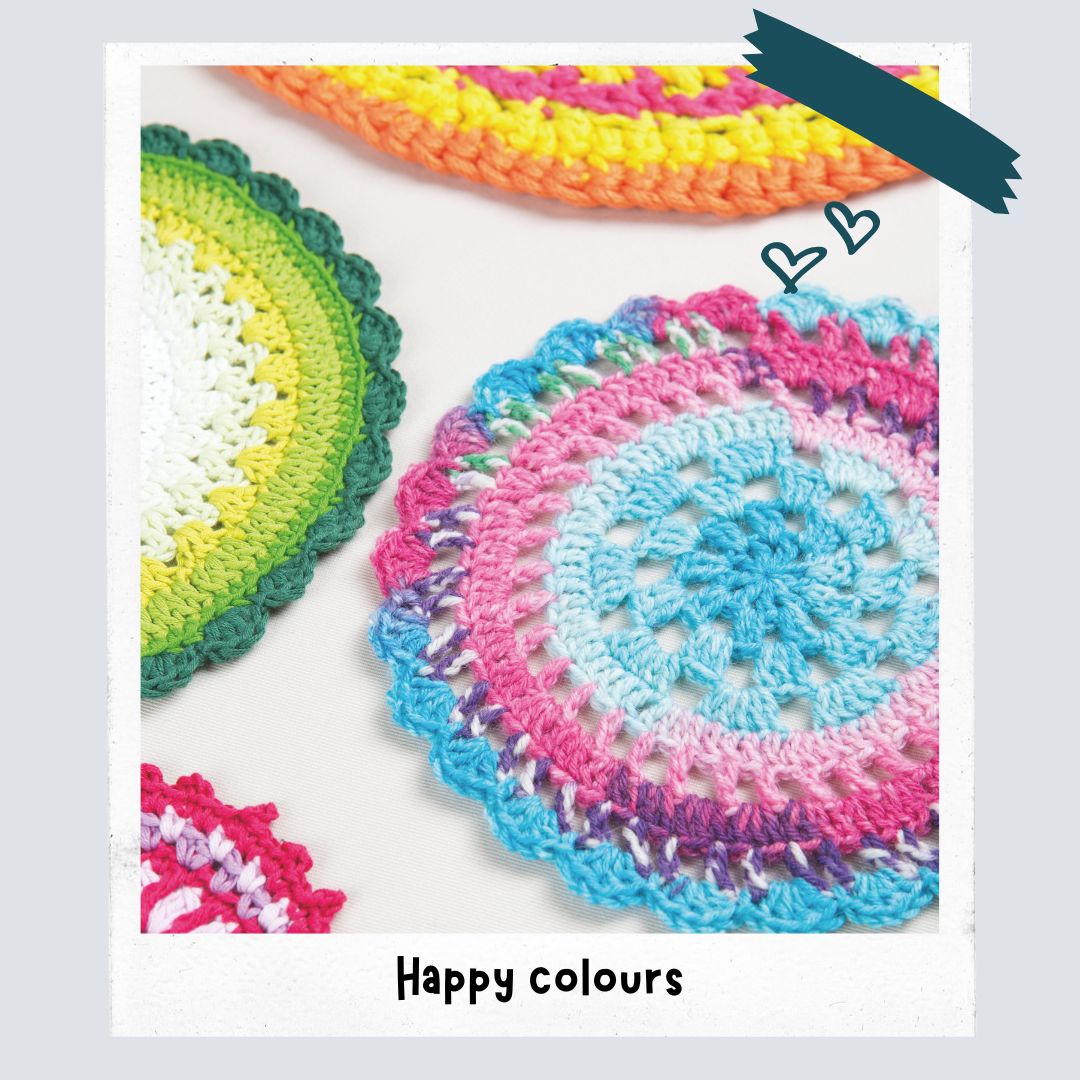
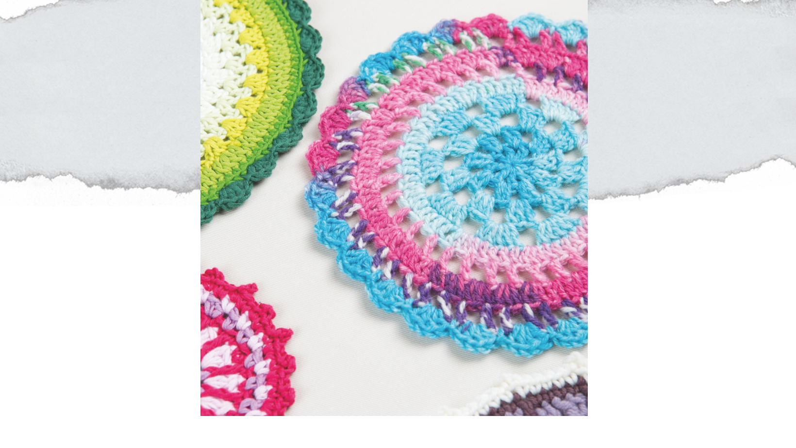
Hi. I hope it is ok to ask. What is the pattern for the colourful circles near the top of the page please. They are beautiful.
Hi Elizabeth - is it the mandalas? These are from a book I wrote called Twenty To Make Crochet Mandalas - with Search Press - let me know if you're in the UK - I can send a copy as I still have loads of the books. I will be adding some Mandala patterns soon on the blog too. Thanks again, Lynne